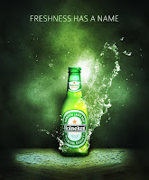
 Line: This design uses line because the whole design is made up of different types of lines. Vertical, horizontal, diagonal and abstract lines are all seen in this design. The lines are used to make the design look somewhat 3D.
  Texture: This advertisement uses texture as the main focus of design. The texture is shown by looking like a liquid splashing, it creates an effect that is appealing to the audience. It makes the drink look refreshing and cold to drink.
  Value: This advertisement uses the element of Value. It is shown by all the different shades of colors and the lightness and darkness used. Value draws attention to the advertisement and makes the audience want to keep looking at it.
 Space: This poster advertisement uses the element space. It mostly uses negative space to form the image. The negative space acts as a "cut out" and shows how simple a design can be, but still portray a message.


No comments:
Post a Comment